
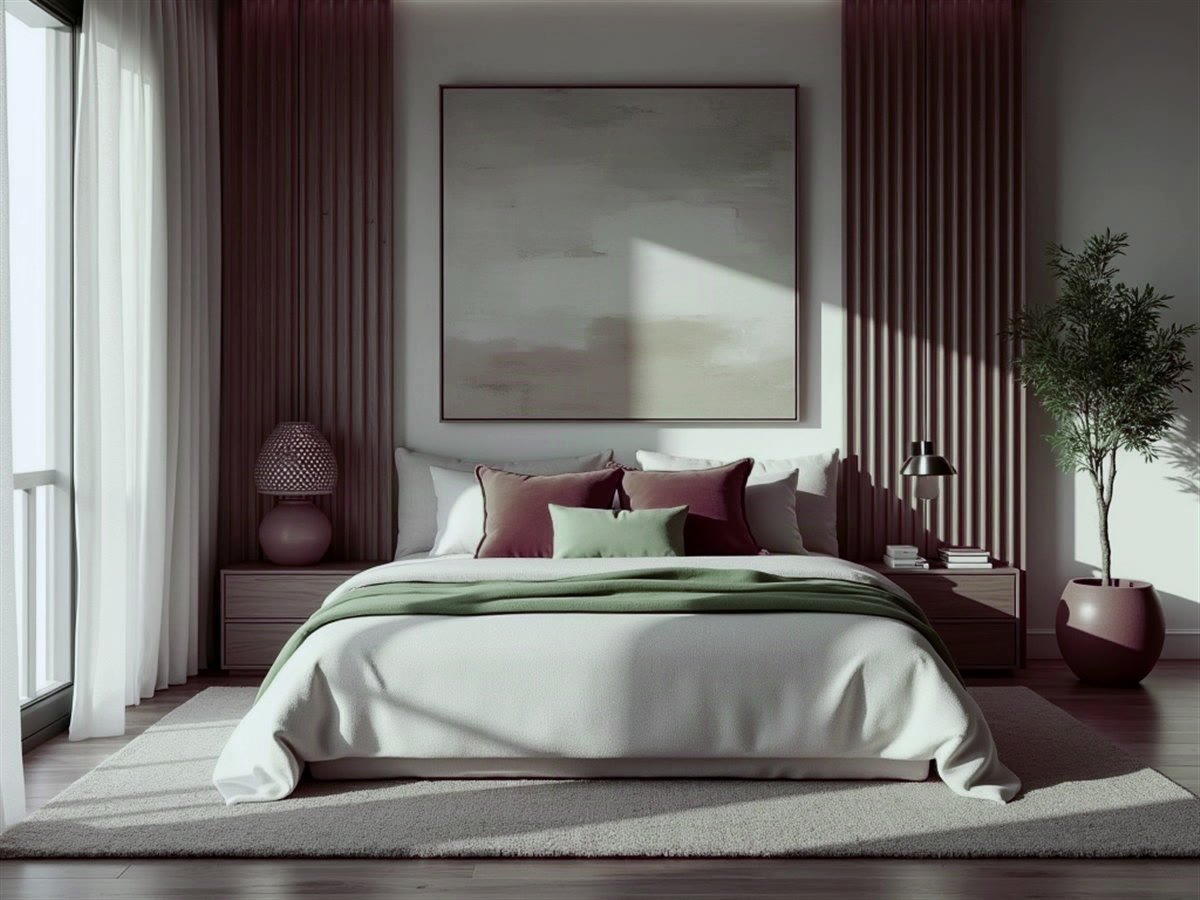
Colour isn't just decoration — it measurably shapes mood, sleep quality and focus. Most of this is intuitive once it's pointed out: nobody wants to fall asleep in a bright red bedroom, and nobody wants their study to feel as chaotic as a playroom. The trick is matching the psychology of a colour to how a room is actually used, rather than just how it photographs.
Bedrooms — Choose Calm Over Trendy
Cool, muted tones — soft blue, sage green, warm greige — lower visual "arousal" and genuinely help with winding down. Saturated reds, bright oranges and strong yellows are the ones to avoid on the main walls of a room whose entire job is helping you sleep. If you love a bold colour, it can still show up here — just as a small accent, not the dominant tone.
Living & Dining Rooms — Where Energy Is Good
These are active, social spaces, so you can afford to be bolder. Warmer, earthier tones — terracotta, mustard, warm browns — support conversation and even appetite, which is exactly why they work so well in dining areas. Since these rooms aren't used for rest, a livelier palette reads as inviting rather than overstimulating.
Kitchens — Clean Energy Without Chaos
A crisp white or cream base carries a strong association with cleanliness, which is part of why it remains the default kitchen choice. One energising accent colour — on an island, a backsplash, or cabinetry — adds personality without disrupting that clean feeling.
Home Office or Study — Colour for Focus
Low-saturation cool neutrals and greens support concentration better than busy, high-contrast palettes. Whatever's directly behind or beside your screen matters most here — keep that zone the calmest part of the room, even if you add more personality elsewhere.
Kids' Rooms — Balance Play and Rest
Soft, slightly playful pastels tend to work better than saturated primary colours across all four walls. Kids' rooms double as sleep spaces, so it's worth reserving the brightest, most stimulating colours for one accent wall or the decor, rather than the whole room.
A colour that photographs beautifully on Pinterest and a colour that feels good to live with every day aren't always the same thing.
A Word of Caution on Trend Colours
Trend colours are trend colours for a reason — they photograph well, and design pages give them a lot of visibility. But they're rarely tested for how they feel lived-in, day after day, for years. Before committing a whole room to a trending shade, it's worth weighing it against how your family actually uses that space, not just how the reference photo looked.
Once you've chosen the emotional tone for each room, the next practical step is making sure your furniture's material and finish reinforces it rather than fighting it — that's exactly the focus of matching board finishes with your colour scheme.
If you'd like a second opinion on whether a colour will actually feel right in your space — not just look right in a photo — that's precisely the kind of thing a design consultation is for.