
Most homeowners land in one of two places with colour: playing it so safe that every room ends up the same shade of white, or panic-picking a trend colour off Pinterest that never quite feels right once it's actually on the wall. Colour is also the cheapest, highest-impact decision you'll make in your home — a coat of paint changes a room more dramatically per rupee than almost anything else. Here's how to choose it properly.
Start With the 60-30-10 Rule
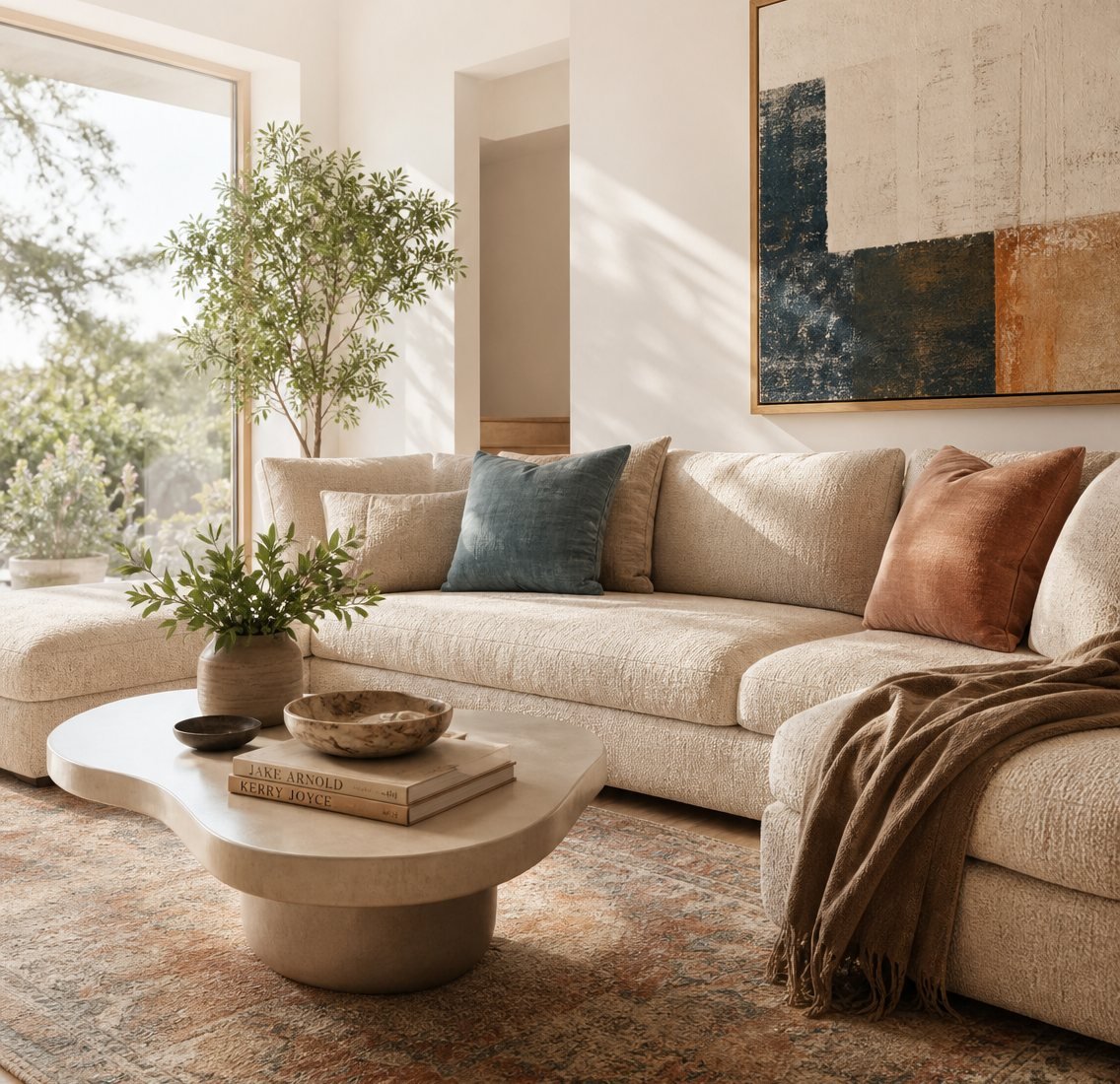
It's the simplest framework professional designers actually use: 60% of a room should be your dominant colour (walls, large surfaces, flooring), 30% a secondary colour (furniture, curtains, rugs), and 10% an accent colour (cushions, art, decor). In a living room, that might mean warm cream walls (60%), a sand-toned sofa (30%), and rust-orange cushions or a piece of art (10%). The ratio keeps a room feeling put-together instead of chaotic, no matter which actual colours you pick.
Let Your Windows Choose Your Undertone
The direction your rooms face matters more than most people realise. North-facing rooms — common in a lot of Delhi NCR high-rises — get cooler, flatter daylight, which can make colours look duller or slightly grey than they appeared on the paint chip. Leaning warm (creams, warm greys, soft terracotta) compensates for this. South- and west-facing rooms get strong, warm afternoon light, which means they can comfortably handle cooler tones without ever feeling cold or clinical.
Before committing to any colour, paint a large swatch — not a tiny chip — directly on the actual wall, and look at it at 11am and again at 6pm. Colours shift more across a day than people expect, and it's a five-minute check that prevents a very expensive repaint.
Room-by-Room Palette Ideas
Living Room
Warm neutrals — cream, sand, soft beige — as the base, with one earthy accent colour like terracotta or olive green. It's a palette that feels calm on a normal day and still photographs beautifully when you're hosting.
Bedroom
Keep saturation low. Dusty blues, soft sage, warm greys — anything muted supports actual rest rather than stimulation. This is the one room in the house where "boring" colour choices are usually the right call.
Kitchen
Cleaner and higher-contrast works well here: whites or off-whites as the base, with one bold accent colour — navy or forest green, for example — reserved for the cabinetry or an island.
Kids' Room or Study
A little more saturation is fine and even welcome, but keep at least one wall calm and neutral to avoid overstimulating a space that also needs to support focus or sleep.
The right palette doesn't shout for attention — it makes the room feel like it was always meant to look this way.
Three Mistakes We See Often
- Painting every room the same "safe" white. In an open-plan flat, this flattens the sense of distinct spaces and makes the whole home feel less considered than it is.
- Trusting a 2-inch paint chip over a full wall. Colour intensifies dramatically at scale — a shade that looks soft on a chip can feel overwhelming across an entire wall.
- Ignoring what's already fixed in the room. Your flooring and countertops were chosen before the wall colour, and they're far harder to change — they should be the actual starting point, not an afterthought.
Once you've settled on a direction, the next question is usually how your furniture's material and finish should follow the same logic — that's exactly what we cover in matching board finishes with your colour scheme.
Getting this right on paper is one thing. Seeing it under your actual lights, against your actual flooring, is another — and that's exactly what a design consultation is for.